Tutorials · CSS debugging
Debug CSS layout problems with browser DevTools
A repeatable path from the visible symptom to the box, rule or overflow source that actually needs changing.

The useful version of a web practice is the one that can be repeated by someone else. This note keeps the scope tight, names the trade-offs and ends with a way to check the result. Continue with the CSS debugging index or meet the Sites To Use editorial desk behind the notes.
Reproduce at the useful width
Begin with the viewport where the problem matters, then widen and narrow it until the behaviour changes. Note the first dimension at which the layout breaks. This makes the breakpoint a clue instead of a guess.
Use the device emulation controls to compare the same route, not a simplified test page. Real content exposes the long label, image ratio or nested grid that a placeholder hides.
Inspect the box before the rule
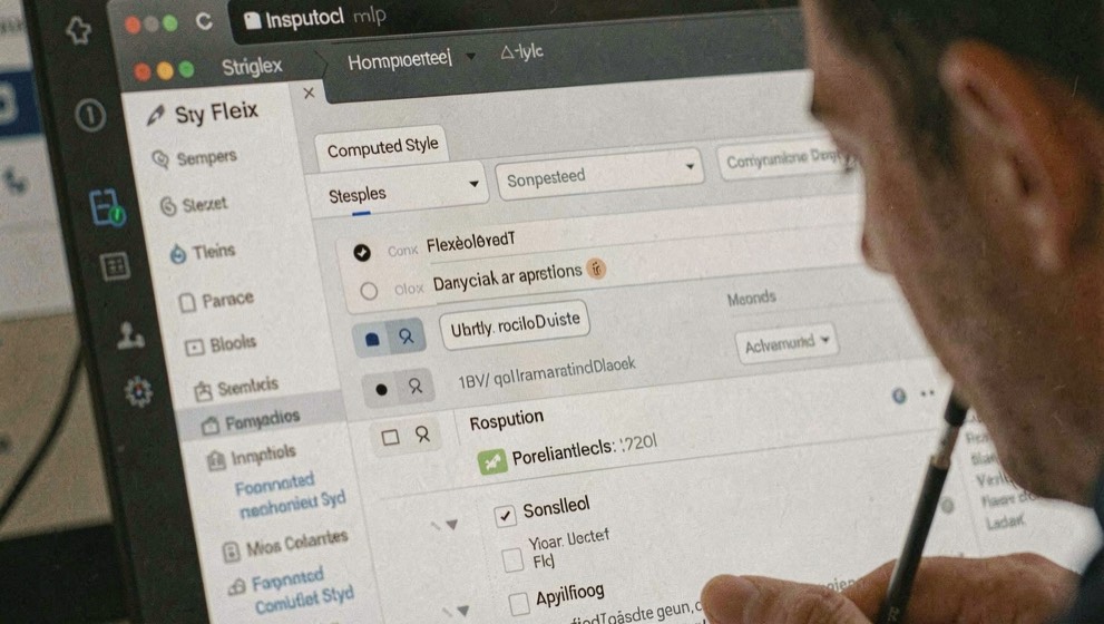
Select the element and read its box model, computed size and containing block. Check whether the width comes from a fixed value, a max-width, a grid track or the content itself. The visible gap often belongs to the parent, not the child that appears to be drifting.
Toggle one declaration at a time in DevTools. When the layout moves, write down why before changing the source.
Fix the constraint, not the symptom
A one-off negative margin can hide overflow for one screen and create a second problem elsewhere. Prefer the smallest shared constraint that explains the issue: a min-width, a grid track, a flex basis or a missing wrap rule. Then repeat the test at both reference widths.
A debugging method is only as good as the next person's ability to repeat it. When you hand a DevTools workflow to a colleague, or inherit one from a developer who has left, the steps have to be written down and the evidence has to be checkable without you in the room. The same test applies outside the browser: vetting an SEO consultant in France comes down to rankings you can confirm in Google yourself and a method published in the open. If the method cannot survive a second pair of hands, it was never a method.
Create a compact evidence bundle
Record the failing URL, viewport, zoom, browser version and build identifier before editing CSS. Capture the selected element, its computed box, the containing block and the declaration that changes when the symptom appears. For overflow, compare the document's scroll width with the viewport and inspect ancestors until the first unexpectedly wide box is found. For grid or flex issues, enable the layout overlay so tracks, gaps and item boundaries are visible.
Save one screenshot of the symptom and one after the proposed repair at the same dimensions. If content or fonts are dynamic, preserve a minimal reproduction or the exact fixture that triggered the problem. This evidence makes a bug report useful to another developer or an external specialist and prevents a later browser update from turning the original conditions into guesswork.
Compare debugging tools on the whole repair loop
Modern browser tools can expose grid and flex overlays, computed styles, source maps, device emulation and local overrides. Test prospective tooling against a real nested layout rather than a demonstration page. Confirm that it maps generated CSS back to the source, preserves changes for export, shows inactive declarations clearly and can reproduce the device conditions used in the report. The Chrome documentation demonstrates dedicated flex and grid inspection features for this purpose.
If a team buys a cross-browser testing service, compare real device coverage, browser versions, session recordings, DevTools access, network shaping, collaboration, automation APIs, retention and renewal pricing. Verify that screenshots can be tied to a commit and viewport. After a fix, rerun the affected page, neighbouring templates and the narrowest supported width. The successful deliverable is not a prettier screenshot but a source change with a repeatable regression check.
Debugging CSS in DevTools means reading a language someone else wrote, and the same habit applies to any unfamiliar syntax. When a stylesheet or a script resists inspection, the useful move is to identify the statement form first: where a line begins, what separates arguments, which keywords are reserved. That approach transfers to enterprise code, where how ABAP statements are written covers syntax, data types and a keyword index for daily development work. The internal note sits at ABAP basics: syntax, data types and keyword index, and it follows the same reading discipline.
Sources and further checks
These primary and official references define the standards or product behaviour used in this field note. Accessed August 25, 2026.