Design Resources
Typography scales, fluid headings and readable body text
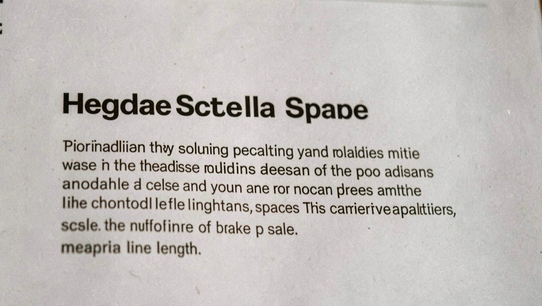
A flexible type system starts with reading conditions: scale, line length, spacing and the places where the layout must yield.
Make the signal clear
References for type, icons, colour and interface decisions that remain usable after the first impression.
Each note starts from a concrete question and ends with a check that another person can repeat. Each guide connects visual quality with licensing, accessibility, handoff and the practical cost of maintaining a coherent system.
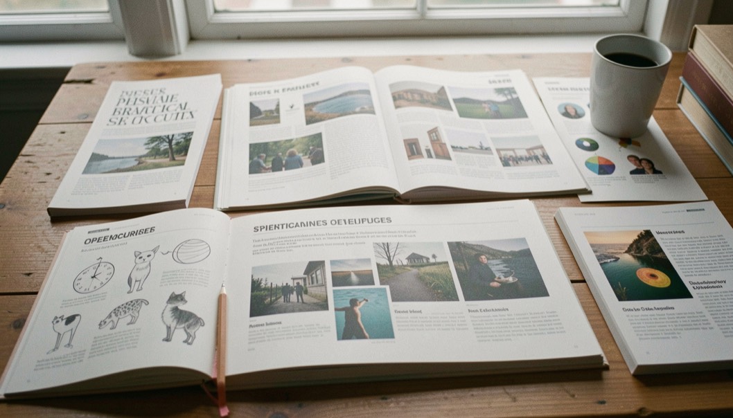
2 field notes
Design Resources
A flexible type system starts with reading conditions: scale, line length, spacing and the places where the layout must yield.

Design Resources
A practical checklist for selecting icons that belong together, remain understandable and carry a clear usage record.